In the network editor, the network objects can be labeled with freely configurable charts (User Manual: Adding charts to network objects). Bar and pie charts are available. For zones you can display the number of inhabitants and jobs in a column chart for example (Illustration 257).
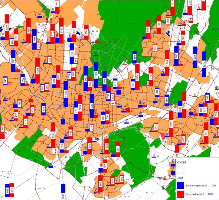
Illustration 257: Number of residents and workplaces per zone
You can also display the results of the mode choice (Mode choice) – the distribution of travel demand to the individual transport modes – for each zone in a pie chart (Illustration 258).
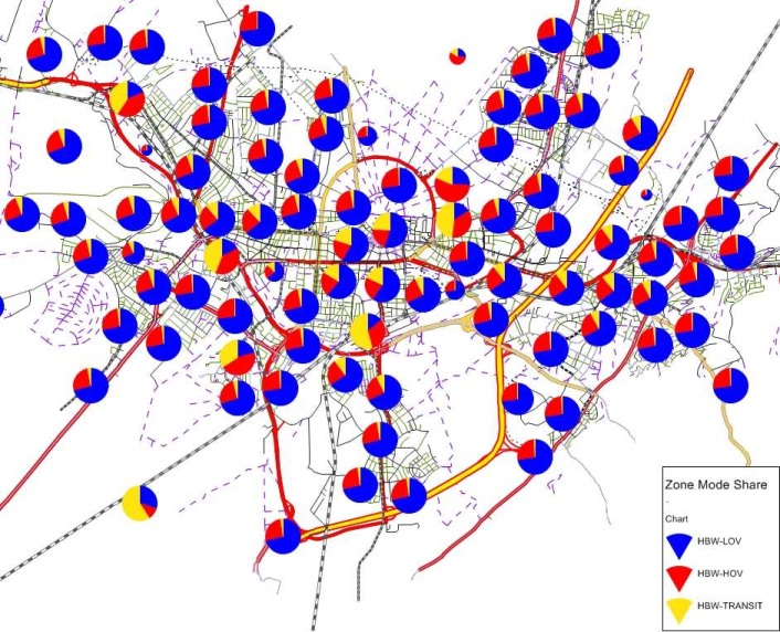
Illustration 258: Display of the mode selection as pie charts for zones
In addition, diagrams can be enhanced with information through classified coloring. For example, the modeled public transport supply can be analyzed and evaluated. In this case, color-coded diagrams can be used to evaluate the total number of passenger transfers and the risk of delay at each stop Illustration 259.
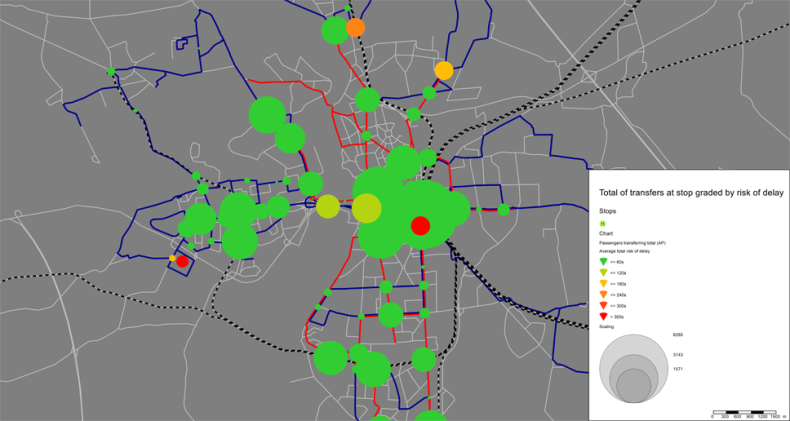
Illustration 259: Total number of passenger transfers at stops assessed by risk of delay
